Artists' books
Artists' books (sometimes referred to as "artist's books" or "artists books;" picky, perhaps, but mentioned here so as to indicate lack of consensus about this somewhat misunderstood object) are books printed in small or unique editions where the text and image (assuming the presence of both) has an inextricably intertwined relationship. The author of the text is often the creator of the imagery as well, though this is not a requirement. Bindings may be simple or fanciful/convoluted. An artists' book may be an almost unimaginably complex structure or something as simple as a brief codex bound with a pamphlet stitch. There are no rules, though there are some conventions, easily flouted.
I began making serious artists' books in 2005 because I have always respected the book as a physical object and was intrigued by rare or limited edition volumes that I encountered in libraries and bookstores. From the start, setting type seemed inseparable from writing text and printmaking; my bookbinding skills, still somewhat minimal even now, were acquired later.
I produce two kinds of books. The more conventional of these are editioned works consisting of my own texts written to a series of premises with accompanying imagery generated either by myself or with collaborators through various printmaking processes. Sometimes the text precedes the imagery; sometimes imagery generates text (or at least premise). The second kind are unique books that are often textless and contain handwork in the form of painting, stamping, letterpress and printmaking processes. Motifs and techniques are sometimes regenerated and recombined.
The difficult thing with artists' books is that they are tactile and intensely private objects that require you to hold them and turn their pages yourself. It's hard to do this without arranging a private show-and-tell (though if you're in the New York area and want to participate in such a thing, by all means let me know) and obviously a gallery of scanned images will function as no more than an imperfect introduction to the books themselves. Nonetheless, that's what's available here.
I've chosen the following books as representative examples of my work, arranged chronologically. As always, if you need or want more information about a given book, please contact me at rhturnbull1126@gmail.com.
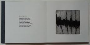
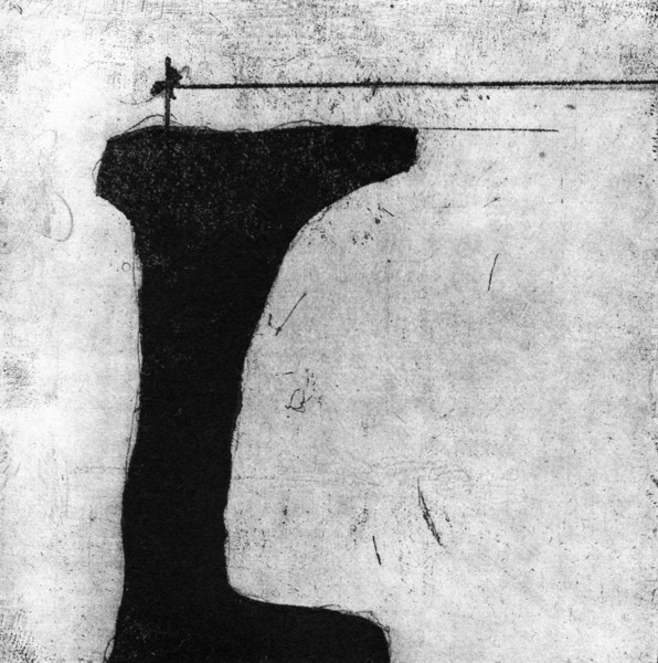
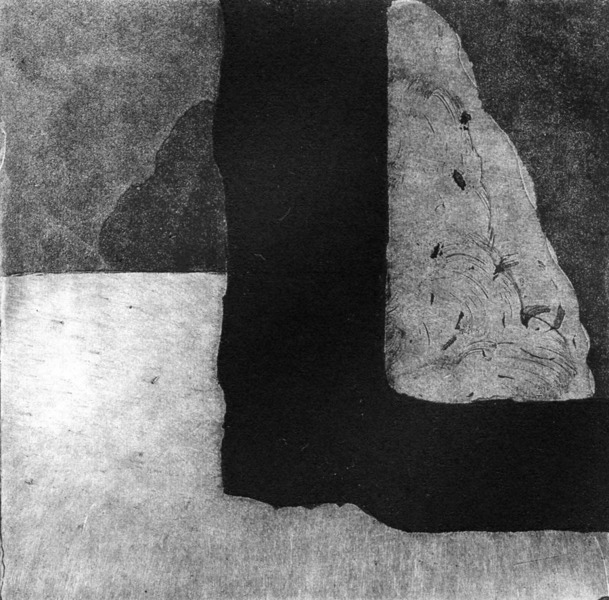
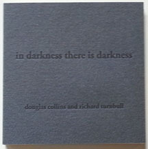
IN DARKNESS THERE IS DARKNESS, 2016, seven etchings by Douglas Collins and texts by Richard Turnbull. Letterpress printing on Revere Silk with St. Armand covers. Drum-leaf binding. Book size: 7 x 7". Edition: 10.
I have known Douglas Collins for many years as a partner in the mysterious art of chemigrams and a colleague at Manhattan Graphics Center. I asked him in late 2015 if he'd be interested in collaborating on an artists' book and outlined a book structure and content for him: he would produce a series of small, 4 x 4" etchings in black and white and I would provide accompanying letterpress texts on the facing page of each folio. We deliberately kept the correlation between text and image loose. I only saw his first set of images after beginning to work on the short poetic texts, and he produced the final images after the texts were completed (and indeed, already printed). This is Douglas's first foray into artists' books and he will tell you he learned quite a lot about editioning and, let us say, quality control. All the usual problems of producing an editioned artists' book notwithstanding, everything in and about this book seemed to mesh at the end.
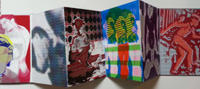
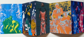
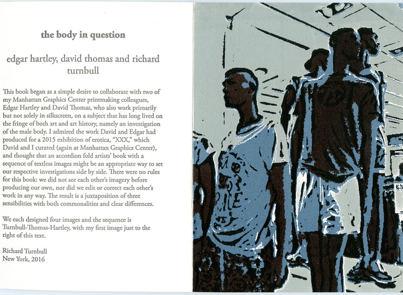
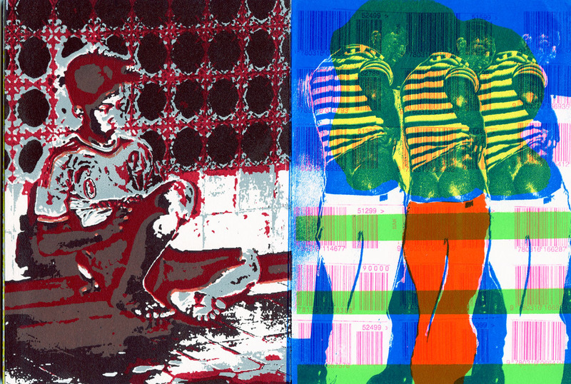
THE BODY IN QUESTION, 2016, silkscreen images by Richard Turnbull, David Thomas and Edgar Hartley, introductory text by Richard Turnbull. Letterpress printing and images on Revere Silk with silkscreened cloth-covered boards. Edition: 20 with 3 different covers. Accordion fold. Book size: 7 3/8 x 5 1/2".
The impetus for this book came from an exhibition of erotic prints at the Manhattan Graphics Center, curated by David Thomas and me, in 2015. David and Edgar and I all submitted work to the exhibition and I noted the similarities of our working methods and aesthetics and asked both of my colleagues if they would be interested in producing a book about the male body where the narrative as such is entirely constructed by imagery. We each devised four four-color silkscreen images without seeing any of the work of our collaborators, and I wrote a brief text placing the study of the male form in an art historical context. We decided that each artist would produce one-third of the covers by taking one of the interior images, reducing it to two layers of black and white, and screenprinting the result directly onto book cloth.


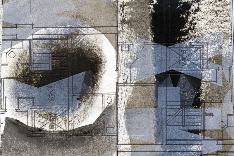
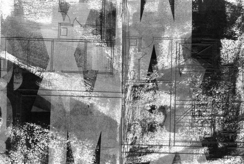
STRUCTURAL COOPERATION, 2010, letterpress on hand-inked paper. Unique edition. 20 pages. Pamphlet stitch with paper cover. Book size: 4 1/2 x 3 1/2".
From 2008-11 I made more unique books than editions, probably because I was attracted by the idea of a book (usually small) as a work of art and also because unique works inspired spontaneity in the studio. One could show up with some painted paper and begin layering polymer plates and wood type and whatever was at hand without much advance planning. (One's full-time teaching job often precluded advance planning, in fact.) I was already preoccupied with layering and transparency in this book, particularly the effect of white and very faint gold letterpress inks over black, gray and white acrylic paint. The sharp lines of the architectural schematic and the wood type letters seemed to give order and structure to the rolled and brushed ink marks underneath. This is a small book heavy with texture and remains a favorite from this period.
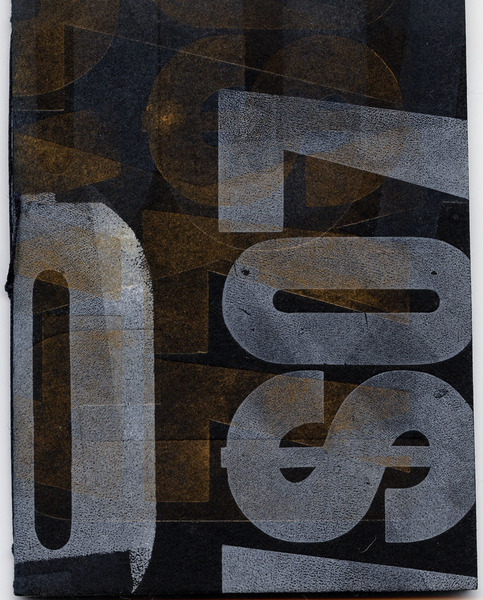

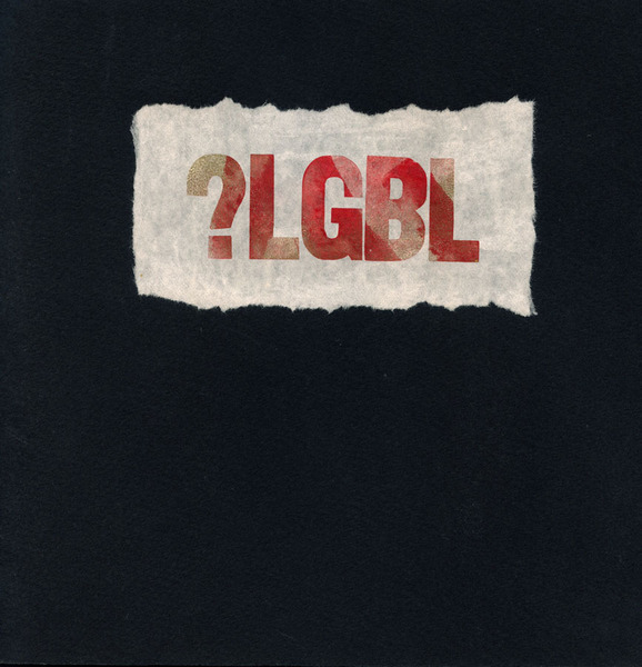
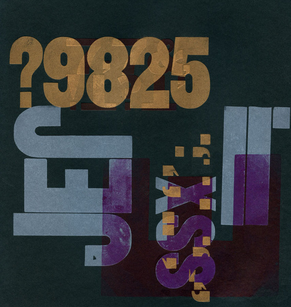
?LGBL, 2009, letterpress. Edition: 3. 12 pages. Pamphlet stitch with paper cover and letterpress-printed label. Book size: 8 3/4 x 8 3/4".
This is the sort of book that can result when one shows up at the letterpress studio one evening after class with no plan and no materials at hand. The book was printed at Studio on the Square in New York (now better known as Intima Press), whose collection of antique wood type I had by then come to love. The idea was to set up a series of wood type ensembles and print them with limited colors (hand-inked) on heavy black printmaking paper. (By now I've forgotten exactly which paper I used but I know I bought it at Pearl Paint on Canal St., RIP.) Certainly the book is about process, in this case the transparency/opacity of layered letterpress inks and the weird things that happen when you print on black paper, but it's perhaps more fundamentally about what happens when individual letters, numbers and symbols are wrenched from any kind of syntactical and grammatical context and rearranged to create a specifically non-linear (or non-narrative) series of patterns. Some of the imagery hovers in a black void and some of it just barely registers, and that was very much the point. The title has occasionally been misread as a statement of gender-preference confusion; it's not.
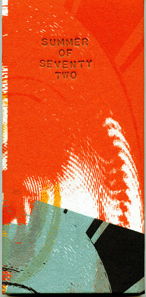
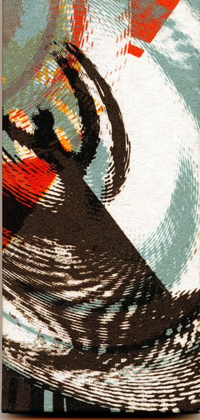
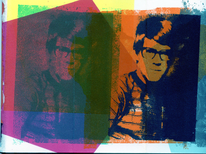
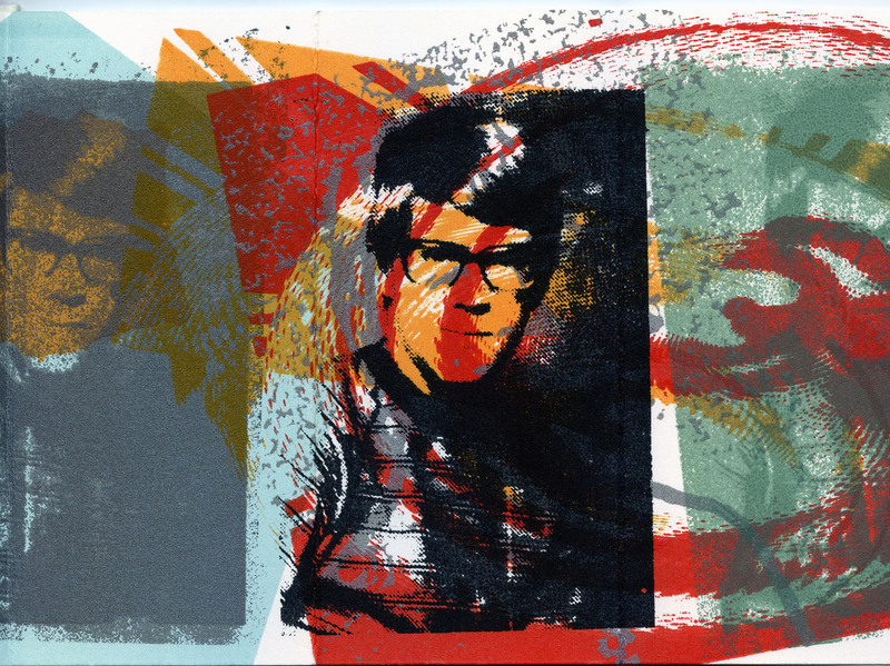
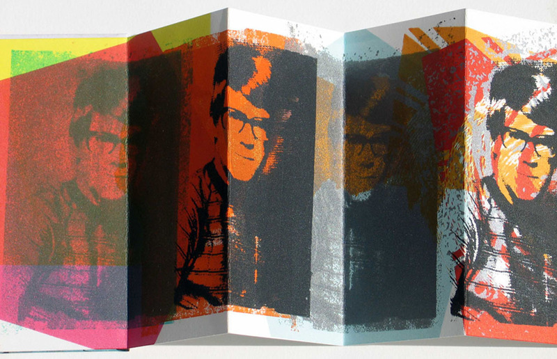
SUMMER OF SEVENTY TWO, 2008, silkscreen images. Unique edition. Accordion fold with paper-covered boards and hand-stamped title. Book size: 6 x 2 3/4".
The imagery here derives from three sources: a high school yearbook photo of a neighborhood friend, a series of solid polygons and the reused forms from another screenprint from that same year. The colors worked serendipitously (they often did not during this early period of experimentation) and the "narrative" is buried in the silkscreened murk. What is this book about? Let's say the shifting colors and clarities of adolescent friendship during one of the most mutable times of life. Or another possibility: a very small autobiographical fragment from a much larger and unfinished series that in some ways continues to this day. I've always held this book back from fairs and exhibitions though for most of the year it rests unseen in a drawer in my studio room.