prints
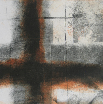 Untitled, 2014, monotype
I began investigating printmaking and artists' books at more or less the same time and thus the two media have always seemed related, with artists' books given most favored nation status until recently because of my earlier, errr, textual experiences. (This is another way of saying that I think I've always been more comfortable with text than image.) Nonetheless, it's not really constructive to claim one form is superior to another based on personal sensibility. The main difference between prints and books to me is that prints are all-at-once and books are sequential. This obviously affects my compositional sense, though it's best not to get into details here.
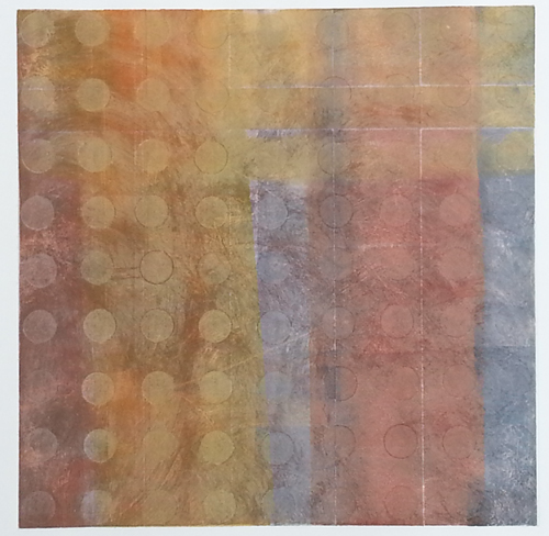
In general I work most often in silkscreen and monotype, with occasional forays into other forms of relief, planar and intaglio printmaking. Because of its flat and rather graphic nature, silkscreen is ideally suited for using photo-based imagery (either from my own photographs or from found/appropriated sources), which I often layer on earlier failed/hideous prints as a way of recycling or reanimating (or murdering) previous work. My monotypes tend to be entirely abstract with departure points from geometry, landscape and the occasional simplified organic form.
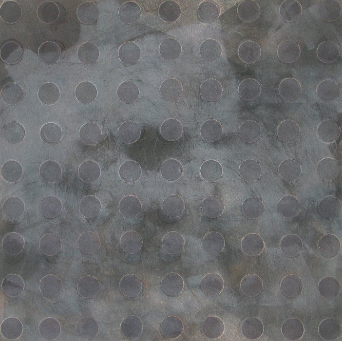
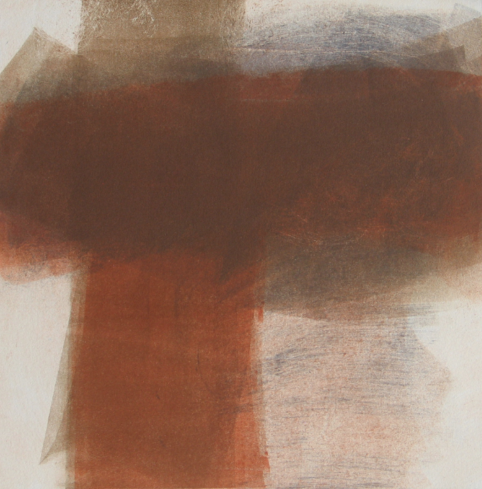
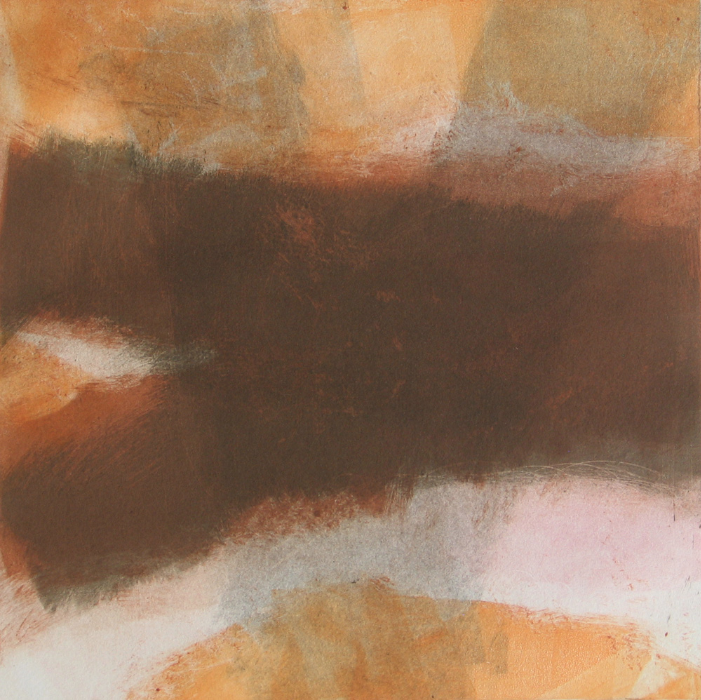
Monotypes
I studied oil-based monotype briefly with Joseph Osina (RIP) at the Manhattan Graphics Center in 2006, though I couldn't make much sense of the medium or its possibilities at the time. In those days I was sampling a tasting menu of printmaking classes to see what best suited my own modes, and monotype seemed too painterly for someone who was a non-painter. I would date more successful experiences in monotype to a series of classes and workshops I took at Zea Mays Printmaking in western Massachusetts, usually with Joyce Silverstone and Lynn Peterfreund, who introduced me to Akua inks and their easy solvent-free clean-up.
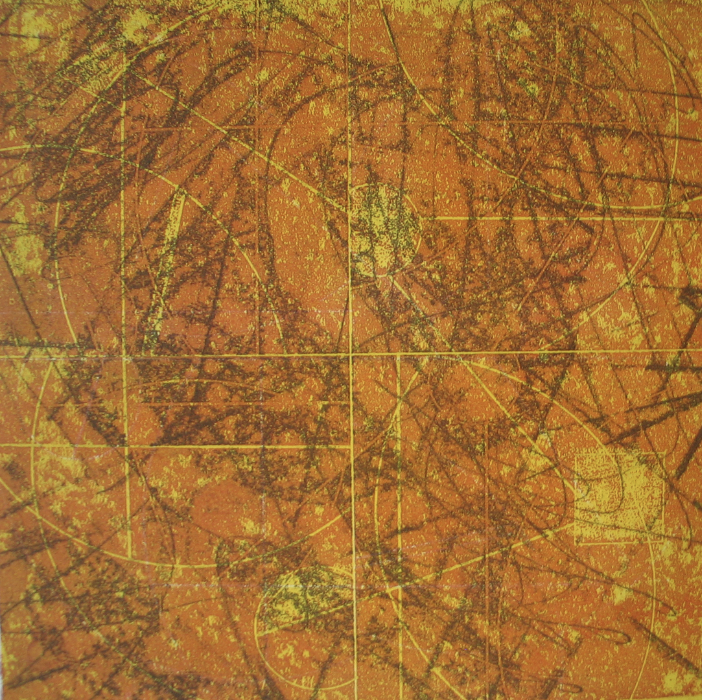 Untitled, 2015, monotype
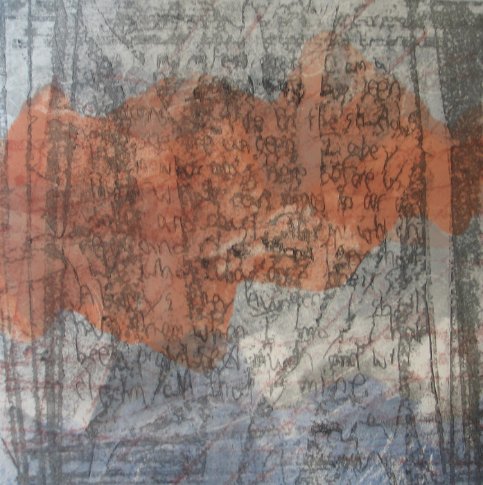
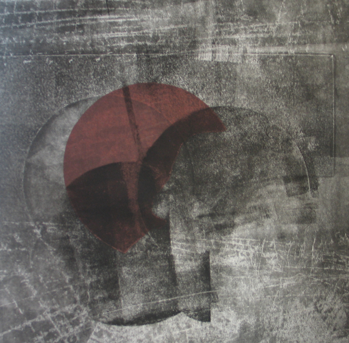
 Untitled, 2015, monotype
 Untitled, 2015, monotype
 Untitled, 2013, monotype
 Untitled, 2013, monotype
 Untitled, 2013, monotype
 Untitled, 2013, monotype
Silkscreen
I studied silkscreen at the Lower East Side Printshop and at Manhattan Graphics Center in 2007-8 and do most of my silkscreen printing these days at the latter. As noted above, it seems a proper medium for found imagery, particularly of a photographic nature. (Copyright lawyers may leave this page now.) Recent work (i.e. from 2013 onward) has, like my monotypes, tended toward the heavily layered, often finished/sealed with a final pass of black. There's a sort of color madness that beginning silkscreeners frequently suffer from when they learn to print and that in some cases takes years to unlearn.
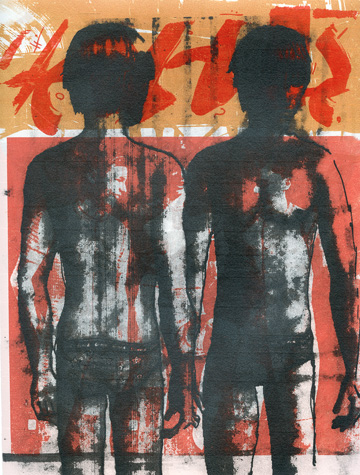
 Growth Spurt, 2014, silkscreen
 Processional, 2014, silkscreen
 The Overload 02, 2014, silkscreen
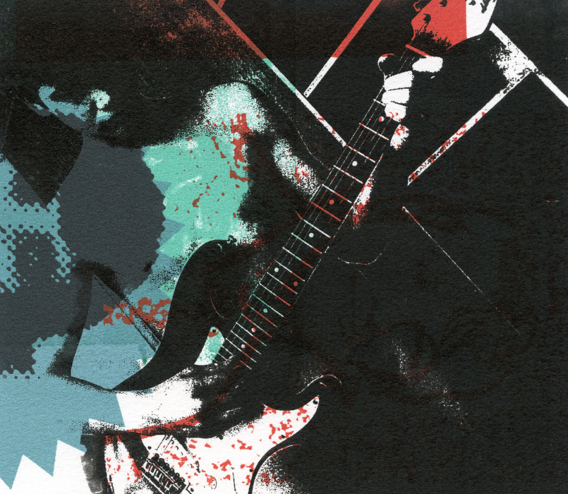 Guitar Boy, 2014, silkscreen
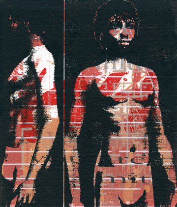 Marvelous Boy 03, 2014, silkscreen